Comparing Web Component Solutions
Brett M. Nelson - Wednesday, October 7, 2020
Need to enhance your current website? Considering a new web project? Before you reach for your standard front-end framework, consider switching to custom web components. Web components keep you from being locked into a specific technology, giving you code that has a longer lifespan, is interoperable with multiple (and future) web stacks, and is reusable and portable between projects.
In this article I'll look at exactly what a custom web component is, why it's a viable choice to JavaScript frameworks, and then I'll compare several web component solutions to see the pros and cons of each.
Overview of Web Components
Over the past few years, there's been a lot of talk about custom web components (sometimes called custom web elements). So, what is a custom web component? Customer web components are "a set of web platform APIs that allow you to create new custom, reusable, encapsulated HTML tags to use in web pages and web apps" (from webcomponents.org). These components are a way to create more modern components not included in standard HTML. For example, you could create a custom (and reusable) drop-down menu, carousel, or specialized help text, all usable in your HTML pages with an HTML-style tag. Web components are based on existing web standards and the features they make use of are being defined by industry specifications.
Why not a JavaScript framework?
At this point, I know what you're thinking but I can do that with ${'React' || 'Vue' || 'Angular' || countlessOtherFrontEndFrameworks.any() }, why would I need this new thing? and yes, that's true but then you are tied to that framework. With a custom web component, you can use it anywhere you can use HTML. Create one component for your company and drop it in the React app Marketing is using, the Vue app that Sales is having developed, and even that JQuery monstrosity from the late aughts that no one wants to touch but the Warehouse folks swear on. And since these components work across stacks, they are by nature longer-lived, continuing on even after you switch to a newer technology stack.
Comparing Web Component Solutions
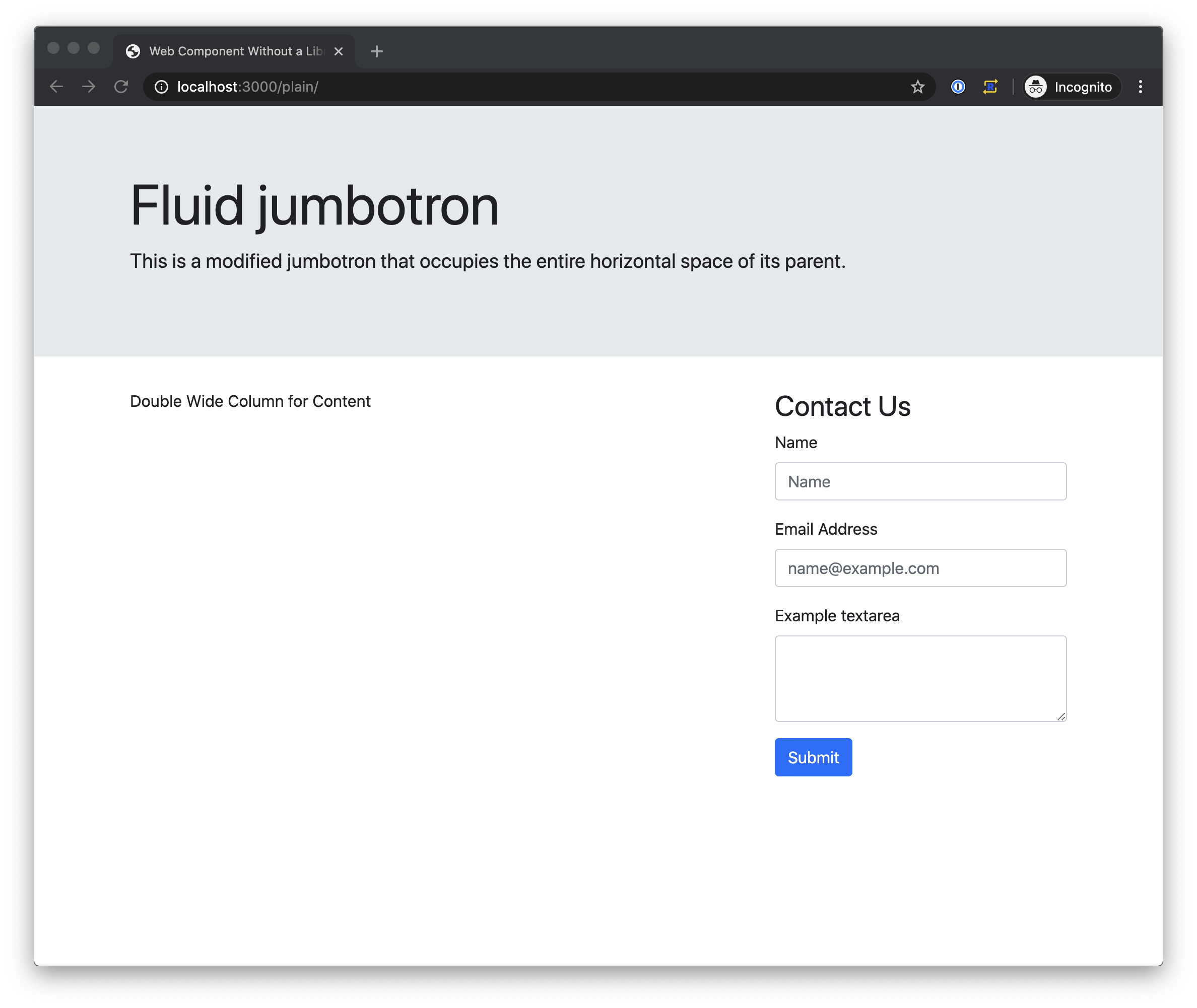
Once you decide to create your own custom web component, you'll want to evaluate some of the ways to implement custom web components. Below I'll take a look at creating an element that adds a contact form to a page by adding the HTML tag for the component and has the ability to set the main header label at the time of placement. This will allow me at development time to create all the functionality and style it requires according to the guidelines I'm following and give the flexibility to update the label for where it's placed.
All implementations will post to a simple Express server and display a thank you message once the server responds.
For the styling I am going to use Bootstrap 4.4.
Plain Web Component
Since one of the benefits of web components is that they follow web standards I thought I should start my comparisons with not using a framework or compiler to create a component for comparison.
To create a plain component, you need to create a class that extends the HTMLElement. Then eventually register that class with window.customElements.define.
class ContactForm extends HTMLElement {}

window.customElements.define('contact-form', ContactForm);
For the label property, I had to create a method that was get only and uses the getAttribute method to get the labels value.
get label() {
  return this.getAttribute('label');
}
I used the constructor to set up the component for use by calling super() to initialize everything inherited from HTMLElement, attaching the shadow DOM, setting the HTML to use when it loads, binding the submit method to the this context of the class so that it can reference class properties later and setting the submitted property to false. It looks like this:
constructor() {
  super();

  this.attachShadow({ mode: 'open' });
  this.shadowRoot.innerHTML = `

  ${this.style}

  <h3>
    ${this.label}
  </h3>
  <form class="needs-validation" novalidate>
    <div class="form-group">
      <label for="name">Name</label>
      <input type="text" class="form-control" id="name" placeholder="Name">
    </div>
    <div class="form-group">
      <label for="email">Email Address</label>
      <input type="email" class="form-control" id="email" placeholder="[email protected]">
    </div>
    <div class="form-group">
      <label for="comment">Example textarea</label>
      <textarea class="form-control" id="comment" rows="3"></textarea>
    </div>
    <button type="submit" id="submit" class="btn btn-primary">Submit</button>
  </form>
  `;

  this.submit = this.submit.bind(this);

  this.submitted = false;
}
Since I want to handle the form when it is submitted, I had to use the connectedCallback and disconnectedCallback to add and remove the event listener for using the submit button.
connectedCallback() {
  this.shadowRoot
    .getElementById('submit')
    .addEventListener('click', this.submit);
}

disconnectedCallback() {
  this.shadowRoot
    .getElementById('submit')
    .removeEventListener('click', this.submit);
}
The last thing that I needed was the submit method to handle submitting the form.
async submit(event) {
  event.preventDefault();

  const email = this.shadowRoot.getElementById('email').value;
  const name = this.shadowRoot.getElementById('name').value;
  const comment = this.shadowRoot.getElementById('comment').value;

  if (!!email || !!comment) {
    const body = JSON.stringify({
      email: email,
      name: name,
      comment: comment,
    });

    console.log({ body });

    const response = await fetch('/', {
      method: 'POST',
      headers: {
        'Content-Type': 'application/json',
      },
      body: body,
    });

    console.log(await response.text());

    this.shadowRoot.innerHTML = `
    ${this.style}
    <div class="alert alert-success" role="alert">
      Thank you for contacting us!
    </div>
    `;
  }
}
In the submit method you can see that we are getting the values with the getElementById method and once the response from the server is complete, the component replaces the HTML with a thank you message.

What I liked about this approach was that I didn't need to install anything or run any build commands to get it working in Chrome.
Unfortunately, since there is no build step, I don't have any polyfills to help me with browsers that don't implement all the required standards. I also feel like I am writing a lot of what I would consider boilerplate code that will end up being duplicated for every component that gets created.
Stencil

Stencil is created by the same team that makes the Ionic Framework. It compiles tsx files down to web components that can be used elsewhere. Since a Stencil component is written with a tsx file it means writing in TypeScript which can evoke strong feelings one way or another and JSX a syntax extension to JavaScript that comes from React development.
To create a Stencil component I had to import the Component, State, Prop, and h from the Stencil core module so they could be used later on.
import { Component, State, Prop, h } from '@stencil/core';
I used the Component decorator on my class declaration to specify the HTML tag and the url for my style sheet
@Component({
  tag: 'stencil-contact-form',
  styleUrl: 'bootstrap.4.4.1.min.css',
})
export class ContactForm {}
The Prop decorators was used to expose my label property so that I can set the label as an attribute on the element
@Prop() label: string;
Then I used the State decorator to track when the submitted property was changed. I did this so that the element re-renders when submitted updates but does not expose it as a public property or an attribute on the HTML tag.
@State() submitted: boolean;
Then I declared a properties for the email, name, and comment to save their values in. These don't require decorators since I'm not going to use them publicly or to cause a render cycle to begin.
email: string;
name: string;
comment: string;
With the internal properties declared, I need methods to handle input events to assign the values appropriately. The handleNameChange method will assign to the name property, handleEmailChange to email and handleCommentChange to comment.
handleNameChange(event) {
  this.name = event.target.value;
}

handleEmailChange(event) {
  this.email = event.target.value;
}

handleCommentChange(event) {
  this.comment = event.target.value;
}
The submit method calls preventDefault on the event to prevent the page from posting then gets the values from the properties to create our message body before posting it to the server. After the response is received the submitted is set to true.
async handleSubmit(e) {
  e.preventDefault();

  const body = JSON.stringify({
    email: this.email,
    name: this.name,
    comment: this.comment,
  });

  console.log({ body });

  const response = await fetch("/", {
    method: "POST",
    headers: {
      "Content-Type": "application/json",
    },
    body: body,
  });

  console.log(await response.text());

  this.submitted = true;
}
The last thing my component needs is a render method. The render method contains an if statement to check the submitted property before showing the thank you message or the form. In the form binding values, like the label, it uses brackets {this.label}. Binding to events uses brackets as well to assign to the events handler onSubmit and onInput but does not use quotes to assign.
render() {
  if (this.submitted) {
    return (
      <div class="alert alert-success" role="alert">
        Thank you for contacting us!
      </div>
    );
  } else {
    return (
      <div>
        <h3>{this.label}</h3>
        <form onSubmit={(e) => this.handleSubmit(e)}>
          <div class="form-group">
            <label>Name</label>
            <input
              type="text"
              class="form-control"
              value={this.name}
              onInput={(event) => this.handleNameChange(event)}
              placeholder="Name"
            />
          </div>
          <div class="form-group">
            <label>Email Address</label>
            <input
              type="email"
              class="form-control"
              id="email"
              placeholder="[email protected]"
            />
          </div>
          <div class="form-group">
            <label>Example textarea</label>
            <textarea class="form-control" id="comment"></textarea>
          </div>
          <button type="submit" id="submit" class="btn btn-primary">
            Submit
          </button>
        </form>
      </div>
    );
  }
}
I liked that this approach handles the polyfills for me and supports back to IE 11.

Something I didn't care for is the use of JSX. I think there is benefit to having separate files for the HTML, CSS, and JavaScript so that I can pull them up side by side in the editor. There would also be extra overhead bringing people onto a project if they didn't have prior experience with JSX or TypeScript.
LitElement
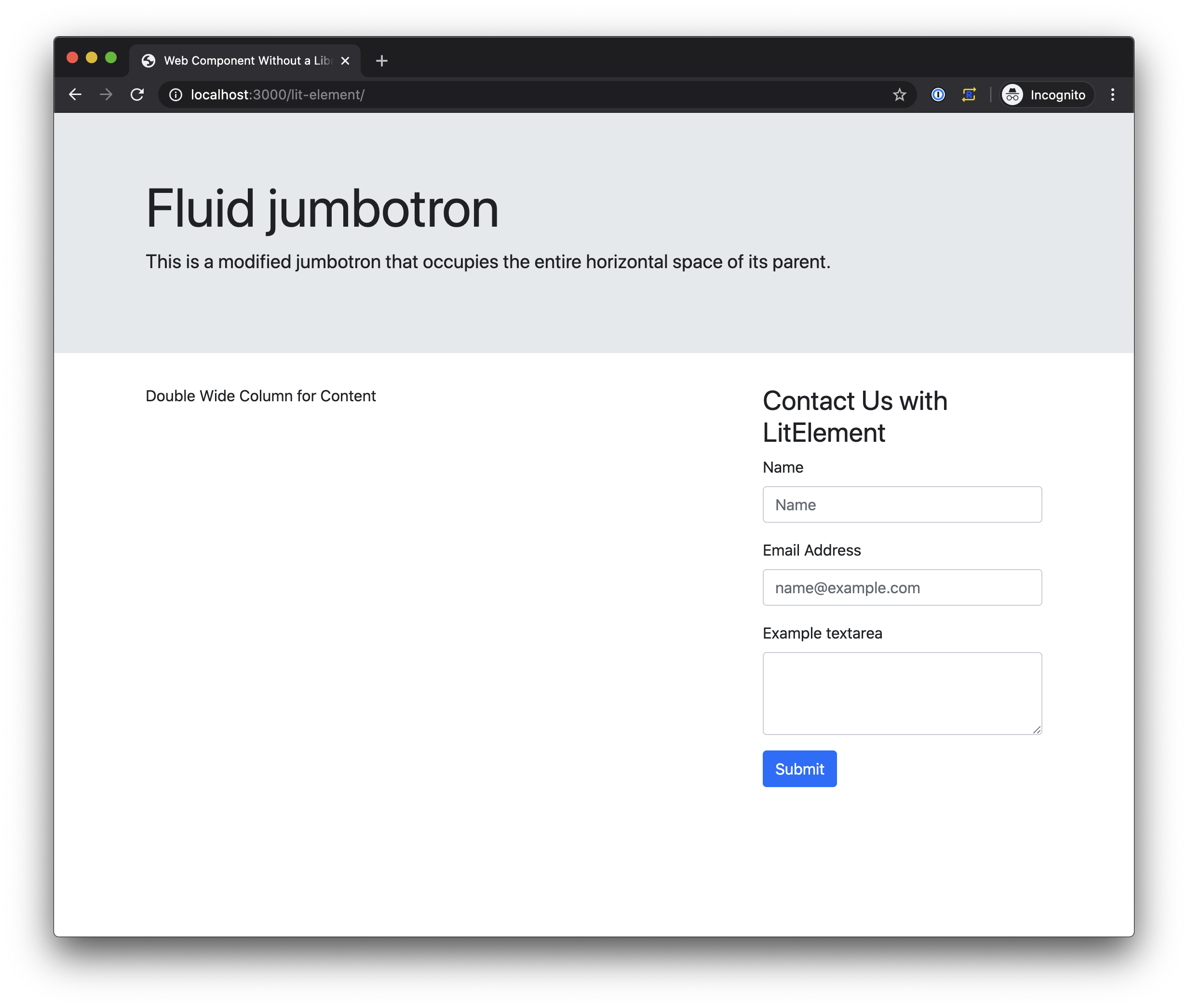
Next up, I created a component using LitElement from Googles Polymer Project. Creating a LitElement requires using JavaScript and maybe some decorators, we can talk about that in a minute.
To get started I had to import LitElement,and html from the 'lit-element' module.
import { LitElement, html, css } from 'lit-element';
I extended LitElement with a class for my contact form and used that class to define a custom element similar to when I created a plain custom element.
export class ContactForm extends LitElement {}

window.customElements.define('lit-contact-form', ContactForm);
To define the properties there is a static get only method that returns an object with the available properties and also defines the types for each property.
static get properties() {
  return {
    /**
     * Label Property
     */
    label: {type: String},
    /**
     * Label Property
     */
    name: {type: String},
    /**
     * Label Property
     */
    email: {type: String},
    /**
     * Label Property
     */
    comment: {type: String},

    /**
     * Label Property
     */
    submitted: {type: Boolean},
  };
}
I set these properties to their initial values in the constructor after calling super to initialize everything inherited from LitElement
  constructor() {
    super();
    this.name = '';
    this.email = '';
    this.comment = '';
    this.submitted = false;
  }
Then I declare the event handler for clicking the submit button. The _onClick handler starts by calling the preventDefault method on the event then it gets the values for the post from the name, email and comment properties before making the call to the server. Once the response to the call is received, the submitted property is set to true.
async _onClick() {
  e.preventDefault();
  const body = JSON.stringify({
    email: this.email,
    name: this.name,
    comment: this.comment,
  });
  console.log({body});
  const response = await fetch('/', {
    method: 'POST',
    headers: {
      'Content-Type': 'application/json',
    },
    body: body,
  });
  console.log(await response.text());
  this.submitted = true;
}
The last thing I added was the render method. This render methods checks the submitted property and returns either the thank you message with the external style sheet link included or the contact form with the external style sheet link.
Since the HTML returned from the render method uses JavaScript Template Literals, binding the values uses the standard ${this.property} syntax. Binding to the inputs assigns the backing property to a .value attribute with the same ${this.property} syntax as with with the binding of to the input for name below as .value="${this.name}. Binding to the click event requires adding an attribute on the button called @click and binds using the standard binding syntax again with the dollar sign and brackets. Below you can see @click=${this._onClick} on the submit button for assigning the _click method to handle the click event.
render() {
  if (this.submitted) {
    return html`
      <link rel="stylesheet" href="./bootstrap.4.4.1.min.css" />
      <div class="alert alert-success" role="alert">
        Thank you for contacting us!
      </div>
    `;
  } else {
    return html`
      <link rel="stylesheet" href="./bootstrap.4.4.1.min.css" />
      <h3>
        ${this.label}
      </h3>
      <form>
        <div class="form-group">
          <label for="name">Name</label>
          <input
            type="text"
            class="form-control"
            id="name"
            .value="${this.name}
            placeholder="Name"
          />
        </div>
        <div class="form-group">
          <label for="email">Email Address</label>
          <input
            type="email"
            class="form-control"
            id="email"
            .value="${this.email}
            placeholder="name@example.com"
          />
        </div>
        <div class="form-group">
          <label for="comment">Example textarea</label>
          <textarea
            class="form-control"
            id="comment"
            .value="${this.comment}
            rows="3"
          ></textarea>
        </div>
        <button
          type="submit"
          id="submit"
          @click=${this._onClick}
          class="btn btn-primary"
        >
          Submit
        </button>
      </form>
    `;
  }
}

LitElements look like they could be very promising but I will probably not consider it for a few reasons. The getting started project doesn't match up with the sample code provided on the site. It looks like maybe decorators were added to the documentation but the starter project was not updated. The starter project didn't come with a build command so I had to figure out the required steps from the documentation that said to use Rollup but didn't say how to. I know the Rollup documentation explains this but it makes me wonder wonder what else might be missing in the documentation for LitElement or not provided as an example in the starter project.
I also thought there's a bit of inconstancy with the binding, the data binding being wrapped in quotes but event handlers not would probably mean I would do it wrong at least half the time.
Svelte
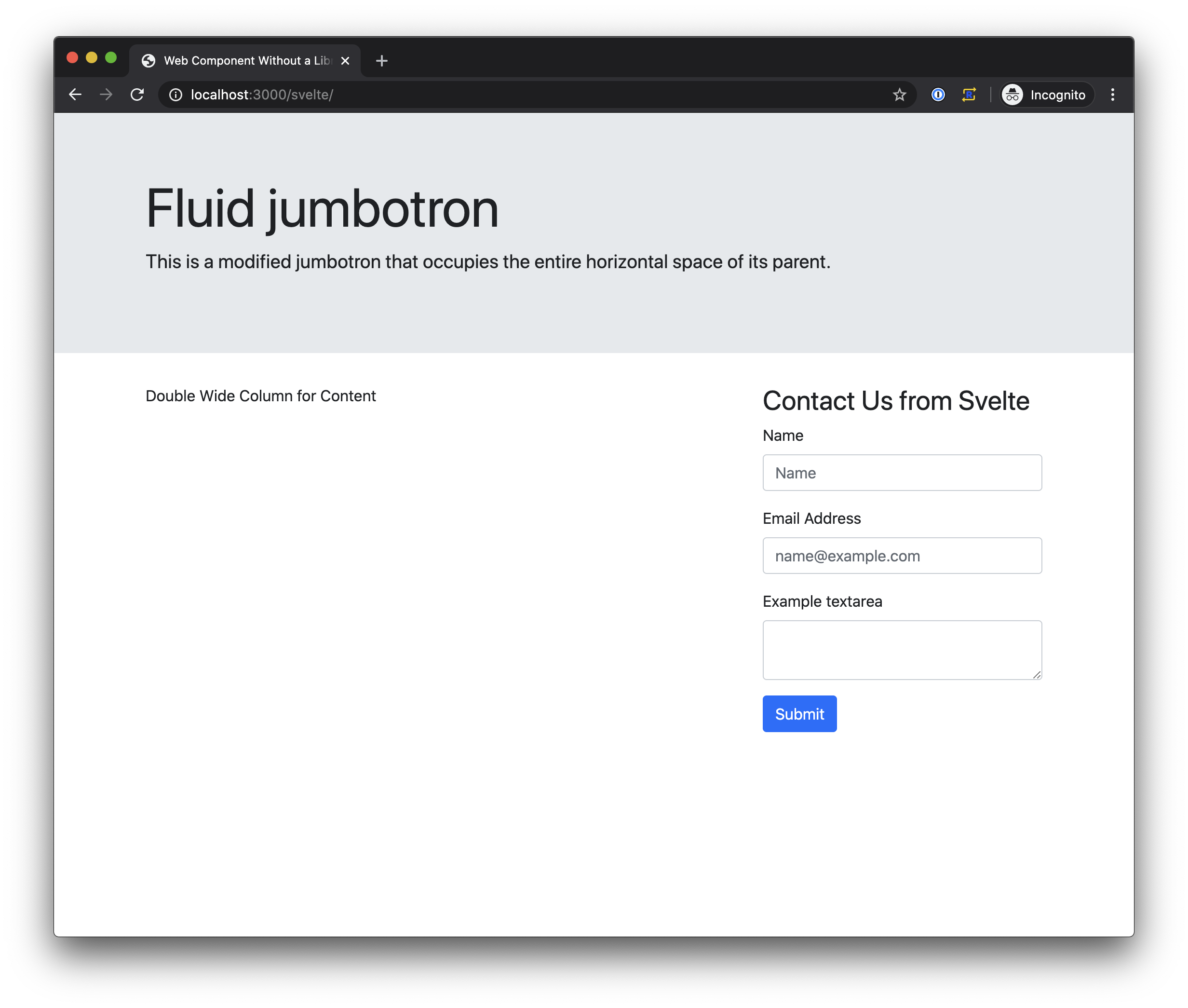
Svelte is a different approach then the others that I looked at as it has it's own file type, .svelte, that includes all the logic, style and markup. To get started, the Svelte documentation recommends using an in browser editor and downloading your project once you have something started.
Since I want to use my component as a standalone HTML tag I had to set the tag as a svetle:options in the beginning on my file.
<svelte:options tag="svelte-contact-form" />
The next section is a script tag like you would see in HTML. The script tag is where all the logic for my component resides.
<script></script>
The first thing I did in my script section was to declare the properties that I needed. I started with declaring and exporting a label property with a default value of 'Contact Us'. I also declared properties for tracking if the form has been submitted, the name, email and comment and assigned the appropriate default value.
export let label = 'Contact Us';

let submitted = false;
let name = '';
let email = '';
let comment = '';
The last thing in the script section is my handleSubmit method. When handleSubmit is triggered it will get the name, email and comment to send to the server. It's interesting to note that this is not used to access the values of the properties.
async function handleSubmit() {
  const body = JSON.stringify({
    email: email,
    name: name,
    comment: comment,
  });

  const response = await fetch('/', {
    method: 'POST',
    headers: {
      'Content-Type': 'application/json',
    },
    body: body,
  });

  console.log(await response.text());

  submitted = true;
}
After the script tag I added my markup for the component. The markup uses HTML elements but it also intermingles some template language.
The markup starts by checking if the value of submitted is true. If submitted is true it displays the thank you message.
{#if submitted}
<div class="alert alert-success" role="alert">Thank you for contacting us!</div>
If submitted is not true the component displays the form. You can see the {:else} below that was started above with the {#if submitted} and ends with {/if} at the end of the mark up.
To display the value of the label property, brackets, {}, are used to access the property. Below you can see the label used in the h3 tag <h3>{label}</h3>
On the form tag I bound handleSubmit to the submit event. It's possible to use a modifier to prevent the events default behavior. The full syntax was on:eventName|modifier={eventHandler} or on:submit|preventDefault={handleSubmit} as I used below.
{:else}
<h3>{label}</h3>
<form on:submit|preventDefault={handleSubmit}>
  <!-- ================== -->
  <!-- form contents here -->
  <!-- ================== -->
</form>
{/if}
Binding data to the inputs involves using a bind:value={propertyName}. So to bind the input to the name property bind:value={name} is used.
<div class="form-group">
	<label>Name</label>
	<input
					type="text"
					class="form-control"
					bind:value={name}
					placeholder="Name"
					/>
</div>
<div class="form-group">
	<label>Email Address</label>
	<input
					type="email"
					class="form-control"
					id="email"
					bind:value={email}
					placeholder="[email protected]"
					/>
</div>
<div class="form-group">
	<label>Example textarea</label>
	<textarea class="form-control"
						bind:value={comment}
						id="comment"></textarea>
</div>
<button type="submit"
				id="submit"

				class="btn btn-primary">
						Submit
					</button>
The last part of my component was adding my styles. I could not find a way to configure the use of an external style sheet so I "worked" around this limitation by copying my Bootstrap.css file contents to a style tag that I placed after my markup. Probably not something to call a "best practice" for multiple reasons.

Overall, though Svelte does a great job of creating custom web components, the main things that I had difficulties with were the near JavaScriptiness of the logic. I spent probably way too much time trying to figure out what was wrong with my component because I had included this to reference one of the properties. There's probably a linter or something that would catch an issue like that but the compiler did not.
I am also not a fan of the custom file type. It's not just Svelte, I have just never had much luck with the plugins that claim to give/provide support for custom file types. Maybe there's a plugin for VSCode that would make the experience perfect but for this comparison I did not look as I did most of my work in the browser editor window. Not something I would recommend doing for any work that will be used by my clients though.
Lighting Web Components
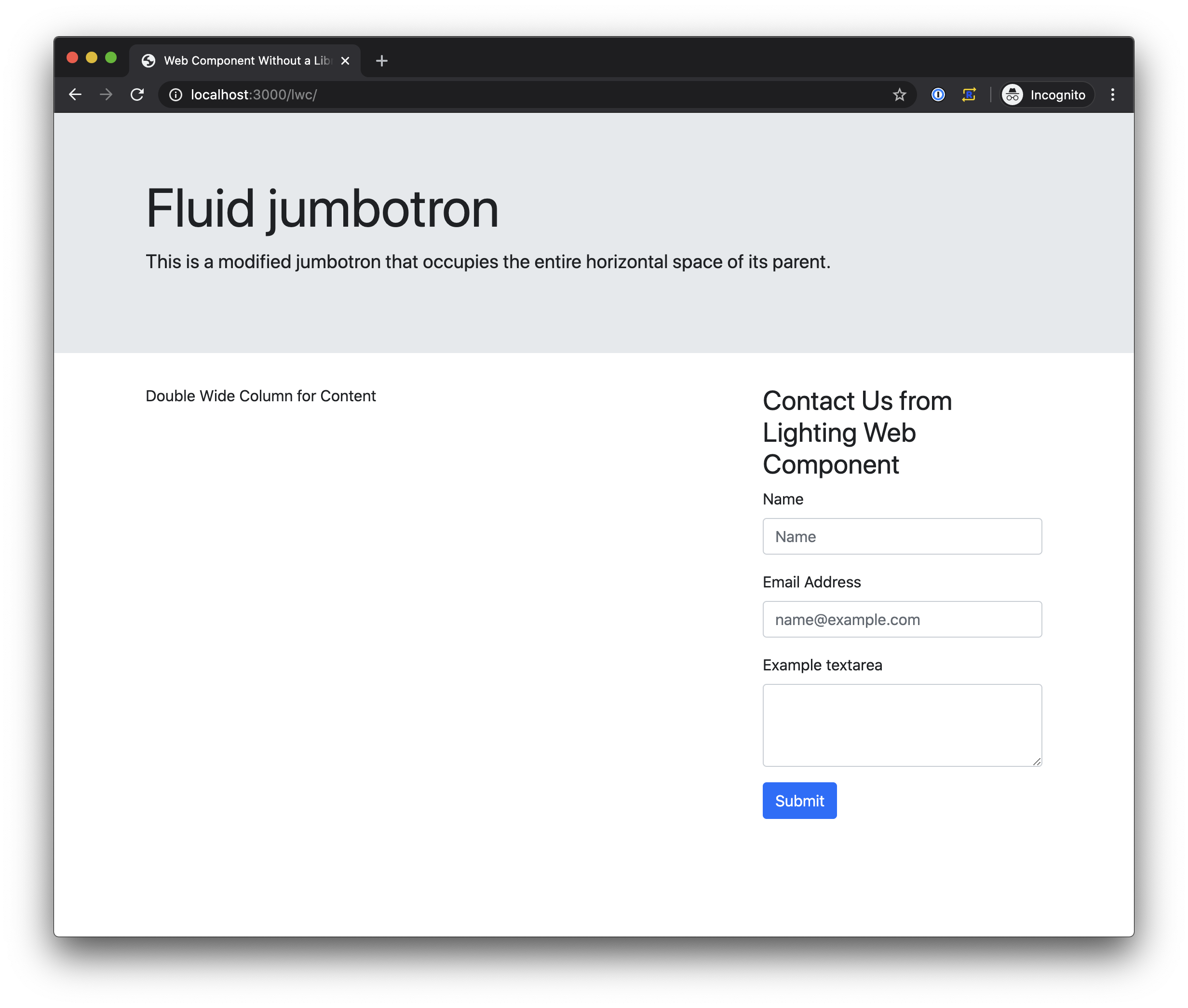
The last way to create a custom web component I tried was Lightning Web Components from Salesforce. Lightning Web Components consist of an HTML file, a JavaScript file and an optional CSS file nested in a folder called a component bundle. The structure of a component bundle also mentions putting test in a __test__ folder. This is the first time that any of these methods for creating a custom component has mentioned testing as part of the components.
Let's look at the JavaScript that controls the logic for my component.
It starts by importing LightningElement and api from the lwc module.
import { LightningElement, api } from 'lwc';
Then a class is declared that extends LightningElement
export default class Greeting extends LightningElement {}
The api decorator that I imported is used to declare a property as accessible outside the component. I use api to expose label as an attribute that can be set when my component is used, in my case I will use it to set the label.
@api label;
Next, I declare the remaining variables and set default values for submitted, name, email and comment.
submitted = false;
name = '';
email = '';
comment = '';
With a Lighting Web Component you have to assign handlers to the inputs. This is probably a good idea since it would allow for validation before the user clicks submit.
In my component I needed a handler for the name input, email input and comment input. Each handler assigns the value from the event to the correct property in the component. If I was concerned about data validation, this is where I would probably trigger some visual indication to the user.
handleNameInput(event) {
    this.name = event.target.value;
}
handleEmailInput(event) {
    this.email = event.target.value;
}
handleCommentInput(event) {
    this.comment = event.target.value;
}
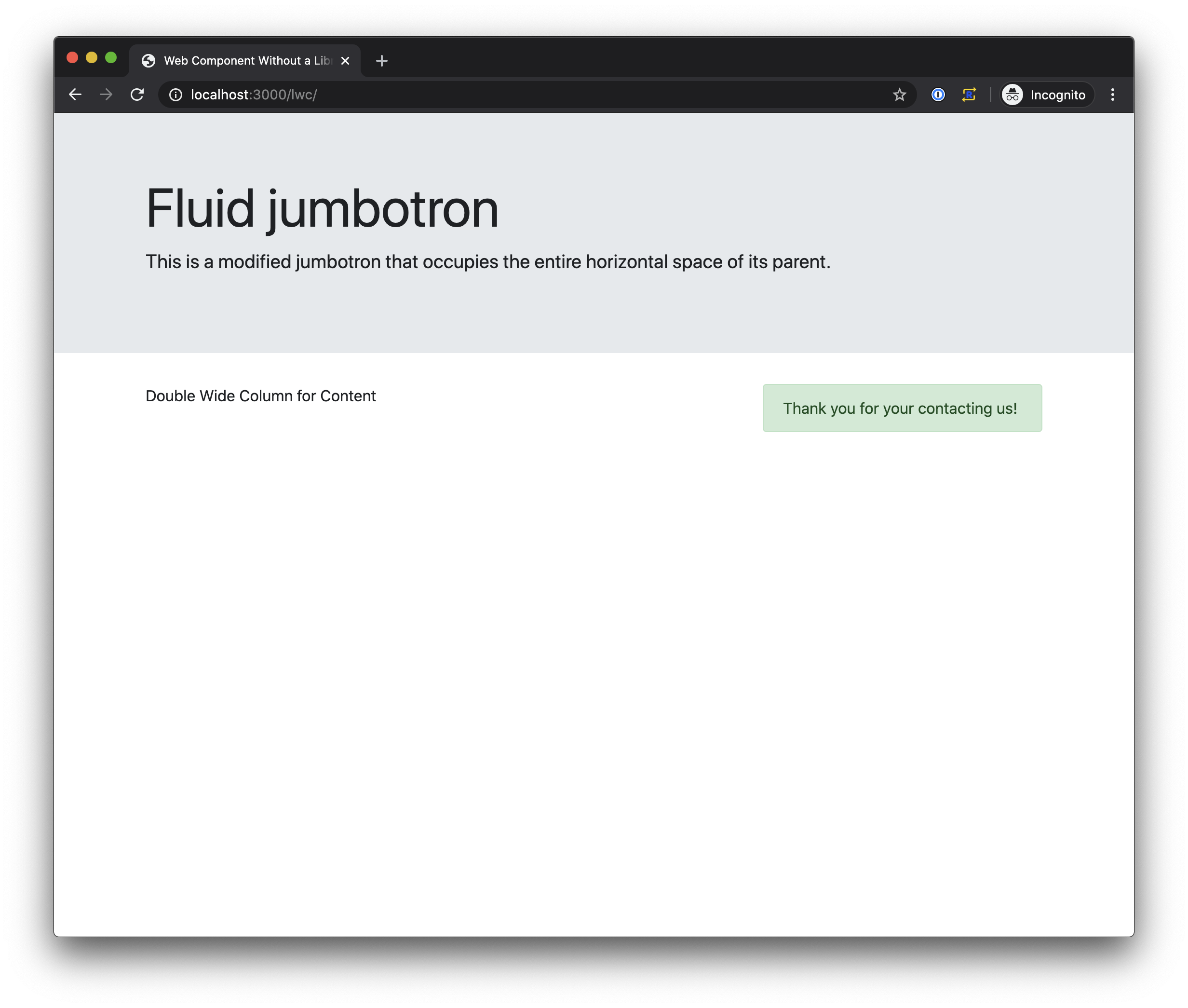
The last thing I need in my JavaScript is an event handler method for when the user clicks the submit button. My handleSubmit method starts by calling preventDefault on the event and then using the properties for name, email and comment to send to the server. When the server responds handleSubmit logs the response to the browsers dev console and sets submitted to true.
async handleSubmit(event) {
    event.preventDefault();

    const body = JSON.stringify({
        email: this.email,
        name: this.name,
        comment: this.comment
    });

    const response = await fetch('/', {
        method: 'POST',
        headers: {
            'Content-Type': 'application/json'
        },
        body: body
    });
    console.log(await response.text());
    this.submitted = true;
}
For the HTML file all the markup goes in a template tag.
<template>
  <!-- ================== -->
  <!--   contents here    -->
  <!-- ================== -->
</template>
My template comes in two sections: one for if submitted is true, one for if submitted is false. Both sections are wrapped in a <template> tag and use a if:true= or if:false= directive to determine if the section is to be displayed. Binding the value of submitted to the if:true or if:false directives is done with brackets, {}, and no quotes as if:true={submitted}.
The first section displays when submitted is true and contains the thank you message.
<template if:true={submitted}>
  <div class="alert alert-success" role="alert">
    Thank you for contacting us!
  </div>
</template>
The second section displays when submitted is false and contains the contact form.
<template if:false={submitted}>
  <!-- ================== -->
  <!--   form goes here   -->
  <!-- ================== -->
</template>
The first thing it does is use the label property to display the message that was set on the HTML tag attribute
<h3>{label}</h3>
In the form I bind to the onsubmit event using the same bracket syntax that has been used to bind text for displaying and evaluating what section to display.
<form onsubmit={handleSubmit}>
  <!-- ================== -->
  <!-- form contents here -->
  <!-- ================== -->
</form>
Binding the name, email and comment property to the input elements uses the same brackets binding syntax value={name}. The oninput handler is also bound using the bracket syntax oninput={handleNameInput}.
The remaining part of the form looks like the following:
<div class="form-group">
  <label for="name">Name</label>
  <input
    type="text"
    class="form-control"
    id="name"
    value={name}
    oninput={handleNameInput}
    placeholder="Name"
  />
</div>
<div class="form-group">
  <label for="email">Email Address</label>
  <input
    type="email"
    class="form-control"
    id="email"
    value={email}
    oninput={handleEmailInput}
    placeholder="[email protected]"
  />
</div>
<div class="form-group">
  <label for="comment">Example textarea</label>
  <textarea
    class="form-control"
    id="comment"
    value={comment}
    oninput={handleCommentInput}
    rows="3"
  ></textarea>
</div>
<button type="submit" id="submit" class="btn btn-primary">
  Submit
</button>
The last thing I need was access to the style sheet. Rather than copying all of Bootstrap into this one component, I created a new component that holds only the CSS file as a style only component. I then imported this component and I get all the benefits of having it on hand. This seems like a better approach as I only need one style component that I can share with as many implementations as needed, but also consolidates any style changes to that one component.
@import 'company/sharedStyles';
I really liked Lighting Web Components' use of standards. There wasn't much issues with figuring out syntax that only applies to one type of project. This seems like a good idea for any team that wants to hire from a broader group of web developers and have new people understand the technology with little overhead so more time could be spent on learning the business and solving business needs.
Reuse
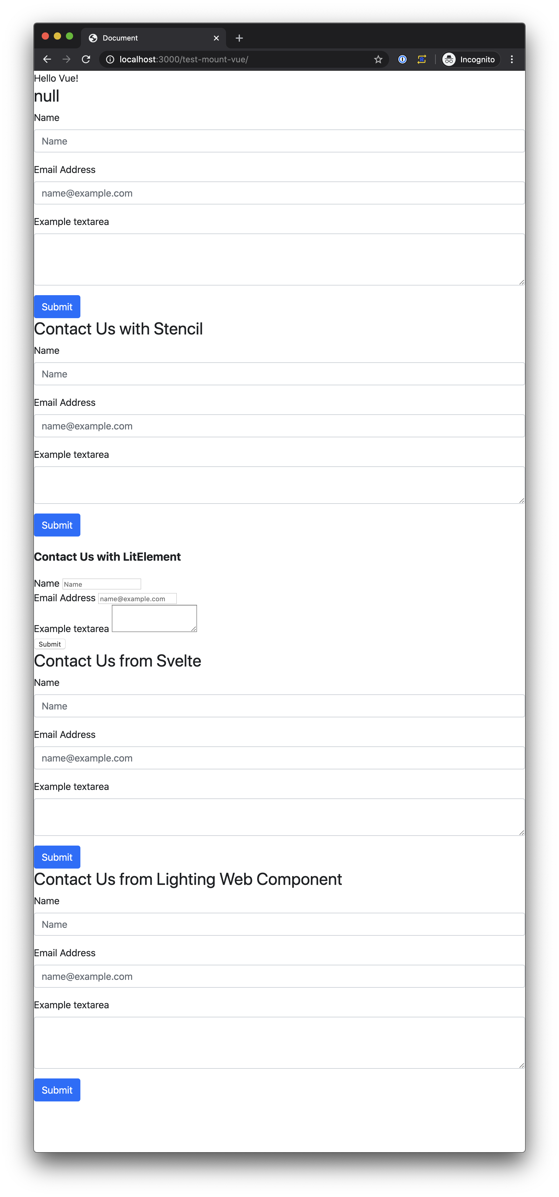
Since one of my goals and a touted benefit of custom web components is sharing components not just in a plain HTML page but also with different libraries that might be used by different teams, I thought I would load up all the components in simple a Vue.js app and see how things went. The results where... mixed.
The plain component didn't get the label correctly so I probably can't recommend using custom web components without some assistance in the set up.
The LitElement component didn't have it's styling. I think this is because of the way the style sheet was imported but I couldn't figure out a work around as it prevented using urls that were not relative to where the component is used. This would make it more challenging to keep things updated where needed and I can't recommend adding extra work that could be avoided.
The components created with Stencil, Svelte and Lightning Web Components all worked great.
Conclusion
Of the three that worked without issues in the Vue app, I'm going to use Lighting Web Components going forward. Since Lighting Web Components are based on HTML, JavaScript and CSS standards, it reduces the risk of not being able to hire developers who can work on it. Using the web standards also means it's less likely to break with a new release. I also liked not having to install any new extensions in my code editor to get things to work properly. As an added bonus Lighting Web Components also works with IE 11 through the use of a transpiler and polyfills so I won't need to worry if a component will work on computer that might not have the latest web browser.