LWC - Using a Child Component
Brett M. Nelson - Monday, August 26, 2019
Hi, I'm Brett with WIPDeveloper.com, I wanted to take a quick look at using a child component and a custom Lightning web component.
So the first thing we have to do is make a component to hold the child component. So I'm going to make a new lightning web component.
I'm going to call this one parent. And then I will make a new one. The first thing we're going to do is give it some markup. Give it a title of parent. So we know where we so we can see it on the page. And I misspelled parent, so let's change that, or let me spell component.
So I'm going to deploy this, it doesn't have the proper targets. So
first, I'm going to take the targets from the other one just so I don't have to.
Deploy it.
Now we have to add a tour page. So refresh our list of components.
Drop it in there. So momentarily saw, it's a child component, and that's because of a dry run I did earlier. Now we refresh our page, we should see our parent component.
Now, we need to add a child component. So let's go to to add a new Lightning web component called child.
And we're going to mark this one as exposed, create it, give it some HTML. Going to give it a panning around small.
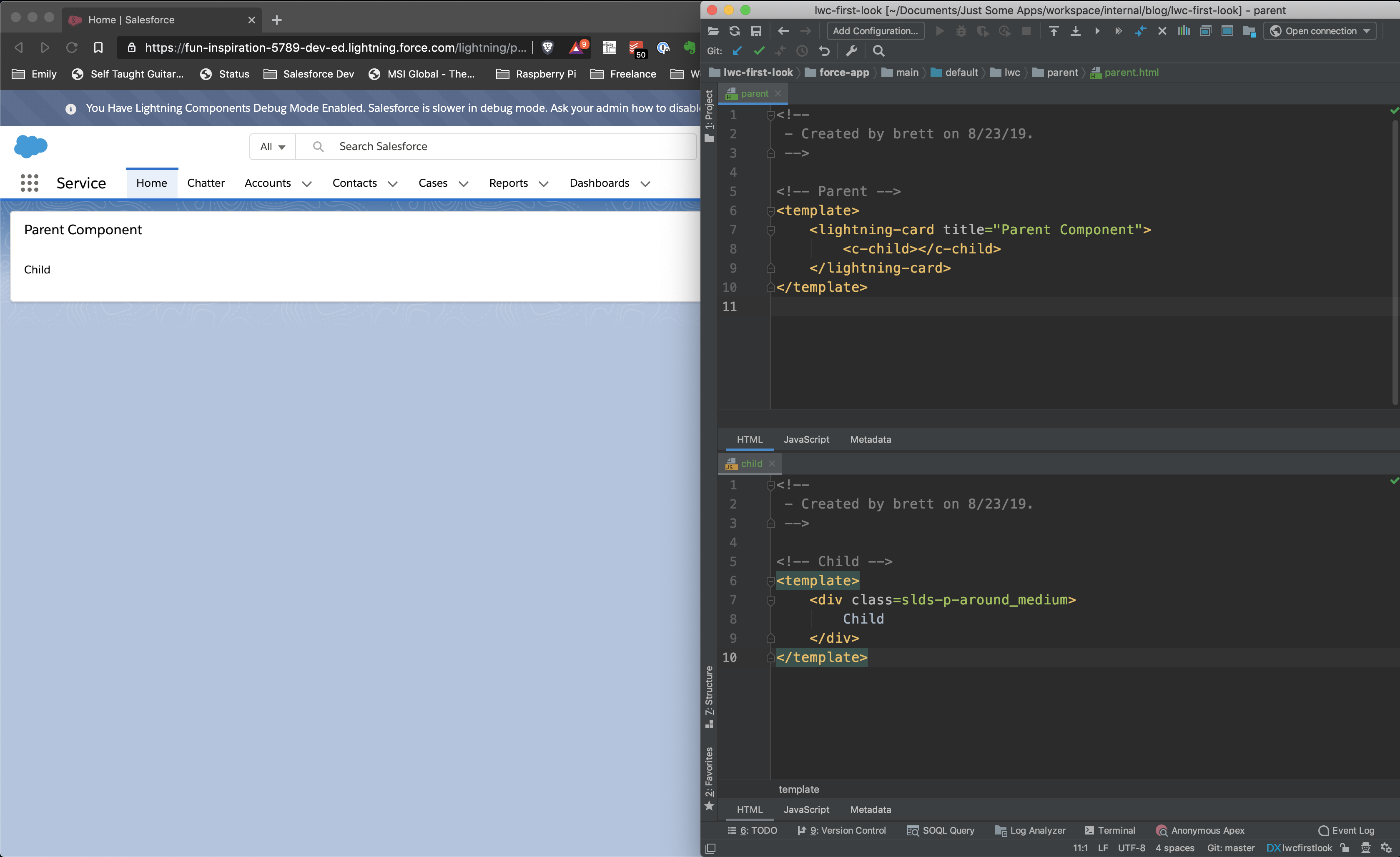
Now, this is deployed to our org, but we have to get it so that it shows up in the body of the parent component. And so what we need to do in the parent component is we're going to add it like we would a normal HTML element.
So all custom web components require two names separated by or two words separated by a dash in the tag. Since we're using Lightning Web Components, all our tags are prefixed with the namespace. So our child component that has one name is actually has a prefix of our namespace. So in this case, it's c, and then c-child.
And we've added our child component to our parent component when we refresh the page again.
We will see our child of course it doesn't look very good. Why does it not look very good?
Oh, because it's outside of the card.
Oops.
No, it'll be inside the card. Everything will be fine.
Now it's our
Doesn't look fine, the child isn't padded enough.
Wrong. Oops. Wrong autocomplete.
slds-p-around_small.
Refresh the page.
There padding is a little better. Why don't we make that medium
Now we can see the child lined up with parent.
And there you go. We are now using a child component in our parent component.
That’s it for now.
Remember to sign up for The Weekly Stand-Up! and you can get updated with any new information we have on WIPDeveloper.com.