Salesforce Mobile SDK and Ionic - Styling Forms
Brett M. Nelson - Tuesday, August 15, 2017
When working on adding the Add Contacts feature I noticed I didn't style the Edit Contact form. And since everyone likes a nice looking form we should probably fix that... and add labels. There were no labels for the inputs either so let's fix that as well.
Before
To begin with our original edit-contact.html form markup looked like this:
edit-contact.html Form
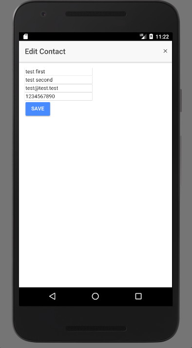
and it rendered something like this:
Android
iOS
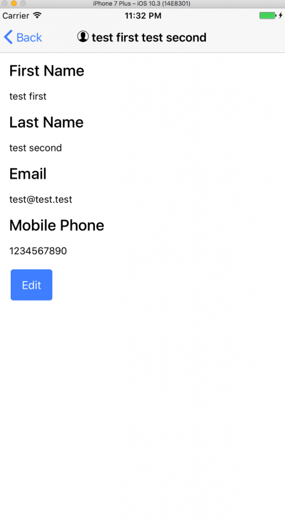
So as you can see, not too pretty.
Let's try to fix that.
Update edit-contact.html
To do this we will need to update the edit-contact.html by replacing all those labels and imputs with ion-items containing ion-labels and ion-inputs.
Since I enjoy the way the Floating Labels behave I'm going to use those but feel free to use what ever style you like. They have Fixed Inline Labels, Floating Labels, Inline Labels, Inset Labels, Placeholder Labels, and Stacked Labels to choose from.
This means for first name we will replace the exciting label and input
Existing
<input type="text" id="FirstName" [(ngModel)]="contact.FirstName" name="FirstName">
With the Ionic Framework components.
Updated
The ion-item is used to contain the two child items so they behave accordingly. The ion-label is the Ionic Framework equivalent of a label and ion-input the input component. Using these we get a complete mark up for the form like the following:
Updated Form
I think I forgot to mention this before but we are putting everything except the button in the form in an
ion-listcomponent.
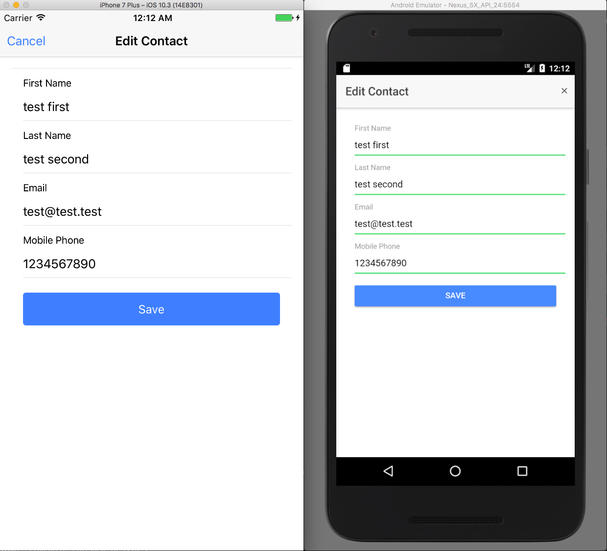
Now we can rebuild our app and see if things look any better... and have labels.
Nicer Looking Form - Android
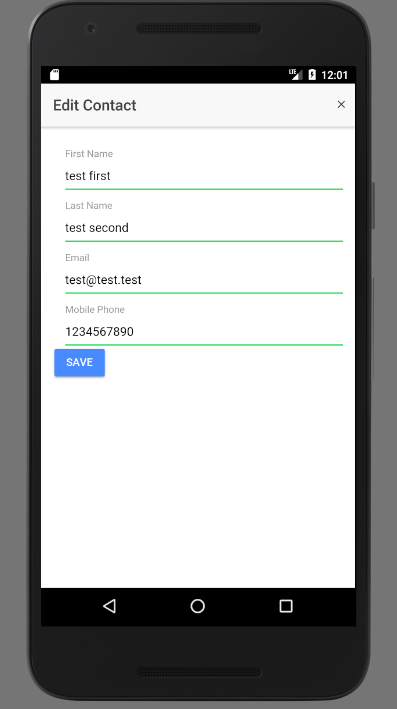
Nicer Looking Form - iOS
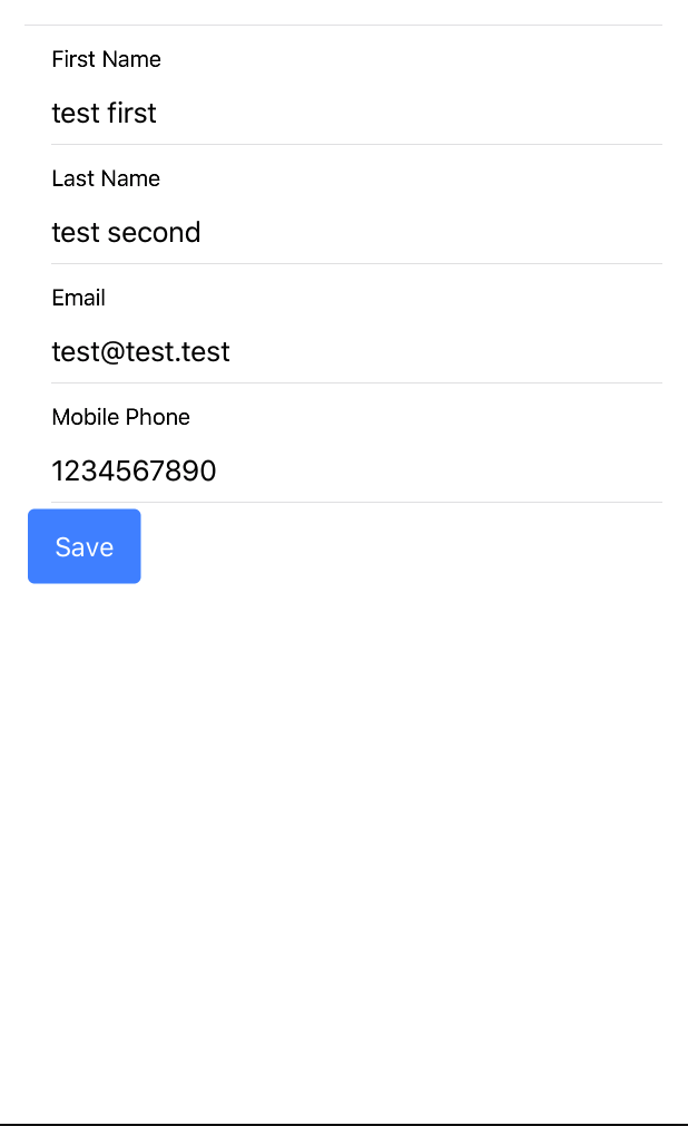
While we are here I'm also going to update the look of the save button so that it has some space by wrapping it in a div that has a padding directive and making the button stretch with the block directive.
Updated Button Markup
Updated Button Look - Android

Updated Button Look - iOS

Conclusion
With this done we don't have to be sooo ashamed of how our edit-contact modal appears.
Don’t forget to sign up for The Weekly Stand-Up! to receive free the WIP Developer.com weekly newsletter every Sunday!
Looking for the code and want to follow along? Find it on GitHub.com/BrettMN/salesforce-sdk-mobile-with-ionic-starter