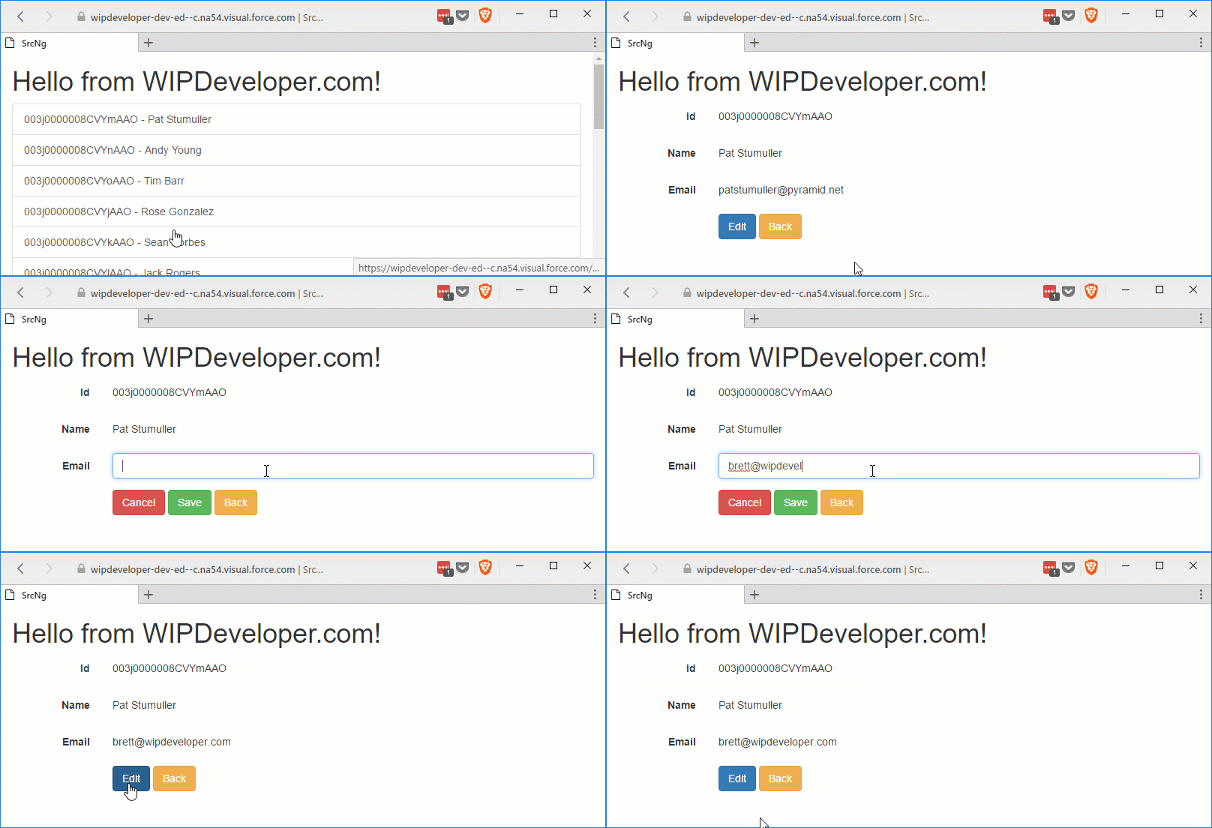
Visualforce and Angular - Toggle Edit Feature
Brett M. Nelson - Wednesday, May 24, 2017
Since we have a component that displays the current value and allows the user to edit at the same time we should probably get it to only display what is appropriate for if we are currently editing or not. We will calling Toggling Edit.
Add editing Property
In our input-text.component.ts lets add a property called editing of type boolean that has the @Input() decorator.
New Property
@Input() editing:boolean;
We will bind the editing property of contact-details.component to this in the contact-details.component.html using the Angular template Property binding to set the value of our input-text.component's own editing property.
Property Binding editing to editing
<app-input-text [(textValue)]="name" [label]="'Name'" [editing]="editing">
Using the square brackets [] here means the data will flow from the contact-details.component into input-text.component so when we change the contact-details.component's editing property with it's edit() method that change will flow into our input-text.component.
Now to make use of it.
Do the Toggle
We could bind both the p for display and the input for editing to separate *ngIf directives but I feel since we are really going for an if than else thing we should explicitly state that in our code. To do that we will use an *ngIf with a non-inlined than template and an else template.
The *ngIf directive will be on a div and take the expression it is binding to, in this case our editing property, a semi-colon followed by the word then, the name of the template when the expression is true, the word else, and the name of the template when the expression is false.
*ngIf then else with Templates
The templates will be ng-template tags and will have an attribute that begins with a pound # and ends with the name of the template. The ng-template tag will not be rendered so only count on the inner html for structure.
Templates
<ng-template #editBlock> <input type="text" [(ngModel)]="textValue" (input)="textUpdated()" [name]="label" [id]="label" class="form-control" /> <ng-template #displayBlock>
This is both templates, one named editBlock and one named displayBlock.
For more
*ngIffun see the docs :)
Our Complete input-text.component.html should look something like this:
Templates
I did add some template property binding to the labels for attribute and the inputs name and id.
Let's see it in action.
Toggle Edit In Action!!!

Conclusion
With our working component we should see how we can reuse it to make the most out out creating it. Do you have any ideas where else we could use it? Let me know by leaving a comment below or emailing [email protected].